
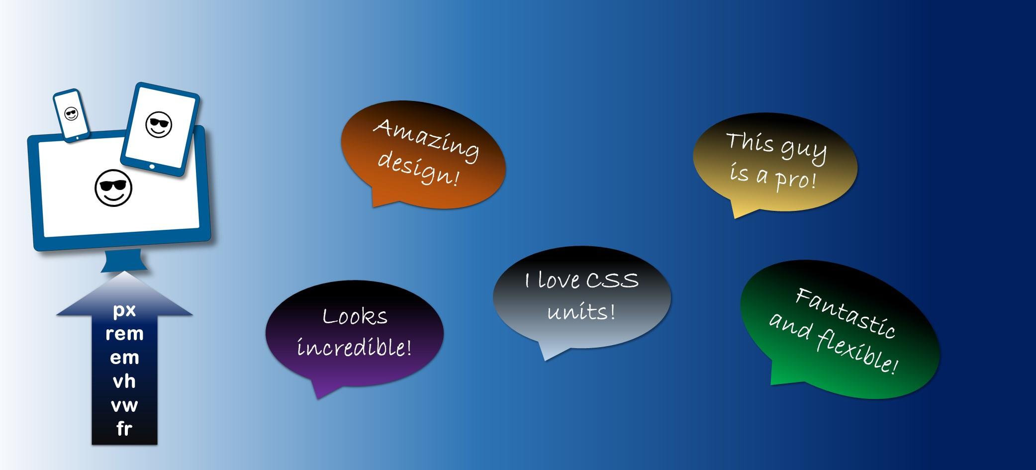
Want to create a website that looks incredible on every device? It all starts with mastering CSS units! In this post, we’ll break down the 6 essential units – px, rem, em, vh, vw, and fr – and show you how to use them like a pro. Get ready to transform your website into a stunning work of art!
1. px (Pixels)
What it is: A pixel is a fixed unit of measurement. It is a static value based on screen resolution.
When to use it: Best for precise control over an element’s size, especially in layouts where pixel-perfect design is required.
					.box {
  width: 300px;
  height: 200px;
  background-color: lightblue;
}
Pros: Predictable and consistent on all screen sizes.
Cons: Not responsive; doesn’t scale with screen size or user preferences.
2. rem (Root Em)
What it is: rem stands for “root em”. It’s a relative unit based on the root element’s font size (usually html).
When to use it: Ideal for responsive typography and scaling, as it scales uniformly across the page when the root font size changes.
					html {
  font-size: 16px; /* 1rem = 16px */
}
.text {
  font-size: 2rem; /* 32px */
}
Pros: Scales uniformly with the root font size.
Cons: Can be difficult to manage when working with deeply nested elements.
3. em
What it is: em is a relative unit based on the parent element’s font size.
When to use it: Useful for scaling elements relative to their parent. Be cautious, though, as it compounds when nested.
					.container {
  font-size: 18px;
}
.text {
  font-size: 2em; /* 36px (2 times the parent font size) */
}
Pros: Flexible for creating scalable, hierarchical layouts.
Cons: Can lead to unexpected results when used in deeply nested elements due to compounding.
4. vh (Viewport Height)
What it is: vh represents a percentage of the viewport’s height. 1vh equals 1% of the viewport’s height.
When to use it: Perfect for making elements adapt to the height of the screen, like creating full-screen sections.
					.full-height {
  height: 100vh; /* Full height of the viewport */
  background-color: lightgreen;
}
Pros: Responsive to viewport height, great for full-screen layouts.
Cons: Can cause issues on mobile browsers due to the browser’s UI appearing/disappearing.
5. vw (Viewport Width)
What it is: vw
represents a percentage of the viewport’s width. 1vw
equals 1% of the viewport’s width
.
When to use it: Ideal for scaling elements based on the viewport’s width, especially useful in responsive design.
					.responsive-box {
  width: 50vw; /* 50% of the viewport's width */
  background-color: lightcoral;
}
Pros: Perfect for creating flexible, responsive layouts.
Cons: May require fine-tuning for very narrow or wide screens
6. fr (Fractional Unit)
What it is: fr
is a flexible unit used in CSS Grid
layouts. It divides available space into proportional chunks
.
When to use it: Great for defining grid tracks that should share available space equally or proportionally.
					.grid-container {
  display: grid;
  grid-template-columns: 1fr 2fr; /* First column gets 1 fraction, second gets 2 */
}
.grid-item {
  background-color: lightyellow;
}
Pros: Provides flexible, responsive grid layouts.
Cons: Only works with CSS Grid; not applicable for other layout types.
Conclusion
Selecting the perfect unit is all about context. Here’s a quick rundown:
– px: Ideal for precise designs
– rem and em: Great for scalable, responsive layouts
– vh and vw: Perfect for viewport-sized designs
– fr: Fantastic for flexible grids
Experiment with these units to craft designs that are both responsive and stunning. Happy coding!